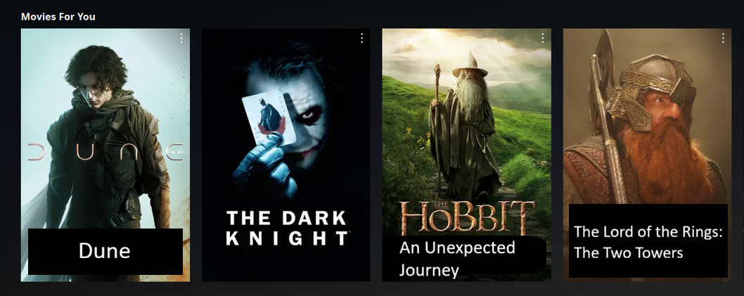
This design looks so cheap to me, it’s just a bunch of random covers, there is no information about the movies presented in any way, the covers are way too big and take up an inordinate amount of space and there is nothing breaking up sections, design is just so fucking dumb now, fuck mobile
rant over 😅
A lot of posters have stylized script in varying sizes and contrast to the background that generally looked fine on big posters but can be hard to read on small icons on a screen.
Just look at the Dune one in the example. Only the u and n are easy to see because the d and e habe no contrast with the background and the font is heavily stylized. Which Lord Rings and Hobbit movies are those? The subtitles are tiny as fuck.
You have to take the screen size into account. This isn’t a mobile view, this is meant for a big tv. Even on mobile if you look at it in a regular size you can easily and clearly read every single title.
On mobile the icons are about as big as my thumb. On a big screen they are about the size of my thumb held out at arms length. The ratio is basically the same and NO I cannot easily and clearly read every single title on mobile or at a distance, especially the three that I pointed out.
That’s not the mobile UI though. On mobile they’re significantly bigger than that, with far less on the screen at the same time.
Like this:
You have trouble reading those on your phone? If you do I suggest going to see an optometrist and/or getting a much bigger phone and turn the resolution way down.
These guys just want to whine and complain and reminisce about how much better the old days were.
I didn’t say every single one was hard to read. You took a screenshot of the ones that are easy to read even when the thumbnail is the size of my thumb. What I said was there were plenty like the examples I pointed out for Hobbit and Dune where they were hard or impossible to read.
You have trouble understanding the difference between a lot of titles and all titles? Maybe you should see someone who can teach you basic reading comprehension skills.
I took a screenshot of the first screen. Weren’t you have a whinge saying that they’re all using the same boring plain white font, and now you’re whining when some use different fonts that you claim are harder to read? Which is it - do you want boring and easy to read, or fancy design that sacrifices UX?
With ones like the lord of the rings, you can clearly see that it is a lord of the rings film, so just click on it and see which one it is. How do you suggest the show “The Lord of the Rings: The Return of the King” on the poster without it just being entirely big white text all over the poster?
Now what Netflix has makes it easy to distinguish between the movies the exact way OP wanted: using characters and plot points from the movies.
On your last statement, maybe you need to brush up on your common sense? There’s never going to be a UI that lets you easily read the full title, including sub-title, of every movie ever released, and its poster art, at every resolution from every viewing distance.
No, I always said that SOME titles were different fonts and many of those were tiny, with minimal contrast, or heavily stylized and hard to read as thumbnails on TV screens AND mobile devices. Dune, Lord of the Rings, and the Hobbit movies were examples of those specific things because they are in the image in the post.
You do understand that you are replying to more than one person in the comments, right?
NO. They can make a name clear in the thumbnail. It isn’t magic, it just takes a minimal amount of effort per listing.
The LotR part of the text is perfectly fine, if the rest of it was the same size it would be perfectly fine. Dune could be fine if the text had better contrast.
Basically they just need to make thumbnails with readable fucking text. The ones in your screenshhttps://piefed.world/post/1294070/comment/6249020#ot are the right size and contrast, but you also took a screenshot of movies and shows with short titles that already had large high contrast fonts in their regular posters. You picked a screenshot of the opposite of what the problem is.
YES THEY CAN. If the title is long enough just make it the text. Otherwise all of the images in the bad examples could just have a high contrast overlay with the title over the bottom of the image and it would work perfectly fine.
Oh god, you think a UI where some movies have no poster but just big plain white text on a black background while others have beautiful posters showing off the actors/story/etc would be good?
🤮
Like I’ve said before - I’d you struggle with reading these titles, go to an optometrist and use more appropriate resolutions for your eyesight. Those are options for people like you.
Also if you have problems reading ”dune”, take it up with the people who made Dune. Netflix etc have to use official art and logos.
The title would have to be pretty fucking long, but there are a few out there.
Here, I fixed the examples in a couple of ways.